![]() ALLISON JOY TOMLINSON
ALLISON JOY TOMLINSON ![]()
Timeline of the Campaign to Protect Migrant Worker’s Rights
Timeline of the Campaign to Protect Migrant Worker’s Rights
Overview
Working within a team of four volunteers over a week-long project, we developed two timeline redesigns for the Centro De Los Derechos del Migrante (CDM) team. The timeline demarcates key victories and successes in the campaign to advocate for migrant worker’s rights over gender discrimination.
︎ Centro De Los Derechos del Migrante, Inc.
︎ Grassroots Designfest
︎ Copywriting, UX Design, UI Design
︎ September - October 2021
Design Challenge
CDM was looking for a timeline that includes everything CDM has done around NAFTA and USMCA in order to use the mechanisms within these agreements to advance migrant worker justice. They wanted this timeline to show their efforts and successes, filings and complaints by migrant workers, etc. as well as the halts along the way. They ideally wanted a (an interactive, if possible) design to feature in their website, in both English and Spanish (potentially other indigenous languages), and as an image/one pager that they can use in social media and other CDM communications materials.
Our Process
To start, our team identified the ask, pulled out insights and goals from the organization, and asked key questions to the stakeholders to understand what they needed. From there we assigned roles and prepared for the next phase.
Credits:
Team: Ellie Bazurto, Chandra Guglik, Erica Granor
Role: Information Design
Inspiration
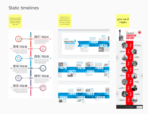
In between our first meeting and our mid-week meet up, we looked up example timelines as inspiration for our projects. We sorted through them and decided which styles inspired us most and felt relevant for the nature of this content.


Wireframes & Copy
Early on, it became clear we would need to make two different versions of the timeline. One for print and one for their website. We got to work designing wireframes for the website. We made a few versions and continued to define the style that would make sense. Collectively, we liked a more horizontal style for the print format. While I worked to develop new headers and summaries for the copy, one of our team members worked to make icons developed for each kind of item on the timeline. Both were designed to create better accessibility to the content.


After several iterations, we tweaked the copy and finalized our designs. I developed shorter introductory paragraphs to draw the reader in, adapting for the print and web format’s space needs. It became clear that there would not be enough room for Spanish as well as English on the print page, so we proposed having one side be English and the other Spanish.
Shareback
Our final web design featured interactivity and the print page featured a faded yellow design meant to signify hope into the future. We also developed a branding guide for ease of transition. At the end, we presented the designs to the CDM team, who really loved them.


 ALLISON JOY TOMLINSON


